
Stranger Things Main Title Sequence
Season One's main title sequence
The title sequence for Stranger Things was created by design studio Imaginary Forces. Scored with the synthesizer-heavy main title track composed by Kyle Dixon and Michael Stein, it opens with a close up on hollow letters with glowing, red edges, drifting through a black void. With grain, fuzzy edges, light leaks, lens flares and jitters throughout, the sequence reflects the organic style of titles from the show’s time period. The credits, in white, fade across the screen over the curves and lines of the title letters, which eventually slide together to form the logo.
Praised as “the best thing on TV,"[1] the sequence has received acclaim from fans and critics alike, and has become an iconic part of the show’s visual identity. A version of the sequence was used for the announcement trailer for season two.[2]
Credits[]
- Executive Creative Director: Peter Frankfurt
- Creative Director: Michelle Dougherty
- Executive Producer: Ben Apley
- Head of Production: Tina Starkweather
- Producer: Dunja Vitolic
- Designers: Arisu Kashiwagi, My Tran, Eric Demeusy
- Lead Animator: Eric Demeusy
- Compositor: Eric Demeusy
- Flame Artist: Eric Mason[3]
Influences[]
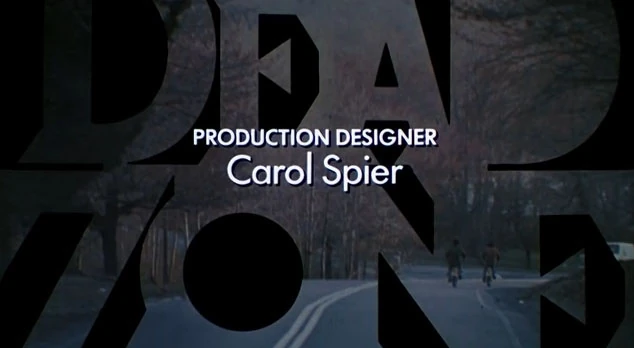
Greenberg's The Dead Zone titles.
Like the show, the title sequence pays homage to the 1980s by echoing book covers and title sequences from the era. The simplistic design of the sequence draws inspiration from the work of Richard Greenberg, who designed many of the Duffer Brothers' favorite title sequences, including Alien, Altered States, Superman, The Goonies and The Untouchables. Imaginary Forces studied Greenberg’s titles for Altered States and The Dead Zone in particular, as well as the titles for Bullitt by Pablo Ferro.[4][5]
The primary typeface, ITC Benguiat, was used on many '80s books including those of Stephen King and the Choose Your Own Adventures series, as well as Dungeons & Dragons handbooks, The Smiths’ Strangeways album and the title sequences of Star Trek movies in the '90s, to name a few.[6][7][8]
Typography[]
The title sequence primarily uses the serif typeface ITC Benguiat, designed by its namesake Ed Benguiat. It is used in combination with ITC Avant Garde for the credits, a sans-serif typeface designed by Herb Lubalin and drawn by Benguiat. Each was released by ITC in the 1970s, and were inspired by art movements of the early twentieth century; Benguiat by Art Nouveau and Avant Garde by Bauhaus.[9][10]
Production[]
Conception[]

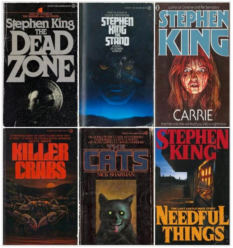
Some of the book covers that inspired the title design.
Executive producer Shawn Levy set up the first meeting over telephone between the Duffer Brothers and Imaginary Forces, the design house behind the titles of Mad Men, Transformers, Boardwalk Empire and Marvel’s Jessica Jones. The brothers spoke in detail about the title sequences they liked, in particular referencing the work of Richard Greenberg.
After the call, the Duffer Brothers sent the company a stack of pulpy horror novels from their childhood for inspiration, most of which were by Stephen King. The brothers then described the series in great detail, and sent Imaginary Forces the pilot script before anything had been filmed, to give them an idea of the tone they were going for. In addition to this, the studio got a rough cut of the theme song early on, and started using it in the animation right away.[5]
Initial concepts[]

"Shadows" concept board.
Imaginary Forces initially presented three ideas to the Duffer Brothers conceived by Michelle Dougherty and storyboarded by designer Arisu Kashiwagi. One was called "Missing", and contained eerie scenes showing what the world looked like without Will Byers, but they decided to drop the idea because they felt like it was too "apocalyptic." Another was "Shadows", which was simply type creating shadows, or objects creating shadows with type.

"Red" concept board.
Dougherty, Kashiwagi and My Tran, another designer, continued to experiment with several typefaces, including Cortez, MT Light and Avant Garde Futura.[6] Eventually, they settled on a concept called "Red", which was close to the final version, but with a different typeface. Initially, it had a motion where the letters locked into place in a rigid and snappy fashion. The Duffer Brothers weren’t responding to that, because it wasn’t a familiar motion in the 1980s, so it was changed to the sliding motion seen in the final version.[5]
Reference footage[]
Michelle Dougherty teamed up with designer and lead animator Eric Demeusy to experiment with analog methods for creating titles, mainly to study the inconsistencies they could find. They got input from designer Dan Perri, who has been in the industry for over 30 years and created the titles for more than 400 projects, including Star Wars. He said “If the opticals were done in the 1980s they’d pretty much perfected the technology by then,” and suggested they do it the easy way, with computers.[6]
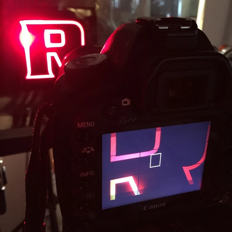

Filming the reference footage.
Dougherty and Demeusy printed the logo on kodalith, an old film format that produces a high contrast, colored it with red gel, and filmed what it looked like when light shone through the letters.[11][12] Demeusy used the footage as reference for the animation, implementing the grain, the imperfect edges on the letters, and the different color values that came through the red film.[5]
Finalizing and animating[]
Imaginary Forces had settled on a typeface and animated with it for a while, but Netflix chose a new logo created by content agency Contend. It used the typeface ITC Benguiat, so Imaginary Forces had to adapt and find the “most beautiful parts” of the new typeface.[11]
Once the direction was decided upon, Dougherty and Demeusy animated the entire sequence digitally with help from Dunja Vitolic on production. Most of the animation was done in Adobe After Effects, as well as a little bit of Cinema 4D. In addition to creating his own film grain in After Effects, Demeusy used Gorilla Grain, which is real, scanned 35mm film grain that was also used in the show. Some elements of Lens Distortion 4K, which is real shot optical lens flares, were used for a few shots.[5]
For season two, the duo initially thought about altering the sequence with other colors, but since everyone really loved the sequence, they decided in the end to tweak nothing else except adding an extra "2".[13] The same was repeated for seasons 3 and 4.
Title cards[]
The title cards seen at the end of the title sequence were also designed by Imaginary Forces and animated by Katherine Lang. They were initially a different version, and the Duffer Brothers came up with the fly-through effect seen in the final version.[5]
External links[]
- "Netflix Stranger Things Main Title" Imaginary Forces.
- "Stranger Things (2016)" Art of the Title.
- "Stranger Things Intro Creator" Strangerthingsintrocreator.kassellabs.io.
- "Stranger Things | Title Sequence" (Without credits.) YouTube: Netflix US & Canada.
References[]
- ↑ "The 'Stranger Things' Opening Credits Are the Best Thing on TV Right Now" Decider. July 15, 2016.
- ↑ "Stranger Things Season Two Promo" Imaginary Forces.
- ↑ "Netflix Stranger Things Main Title" Imaginary Forces.
- ↑ "Stranger Things premiere: The Duffer Brothers introduce their new Netflix series" Entertainment Weekly. July 15, 2016.
- ↑ 5.0 5.1 5.2 5.3 5.4 5.5 "Stranger Things (2016)" Art of the Title. August 9, 2016.
- ↑ 6.0 6.1 6.2 "How the Stranger Things Titles Came Out So Perfectly Retro" Wired. August 11, 2016.
- ↑ Fonts in Use: ITC Benguiat
- ↑ "That 'Stranger Things' Font: Same as 'Star Trek' and Stephen King" Inverse. July 18, 2016.
- ↑ "The Typography of ‘Stranger Things’" Nelson Cash. July 27, 2016.
- ↑ "Stranger Things: meet the design genius behind TV's most talked about title font" The Telegraph. August 4, 2016.
- ↑ 11.0 11.1 "How Stranger Things got its retro title sequence" Vox. August 16, 2016.
- ↑ "Film positive. Red gel. Light." Instagram @ericdemeusy. November 4, 2015.
- ↑ "Stranger Things’ Title Sequence" Vulture. November 2, 2017.